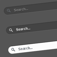
Today’s tutorial is on creating Apple-inspired search box or search field using CSS3 alone. The search field expands slowly when focused/clicked. This animation effect achieved purely using CSS3 transition property. Also, we have used other CSS3 properties such as border-radius, box-shadow and text-shadow to create cool effects.
Here is the code for the searchbox.
<form method="get" action="/search" id="search">
  <input name="q" type="text" size="40" placeholder="Search..." />
</form>
And the following are CSS codes of three different styles of the search box.
Search Box on Dark Background

#search {

}

#search input[type="text"] {
    background: url(search-dark.png) no-repeat 10px 6px #444;
    border: 0 none;
    font: bold 12px Arial,Helvetica,Sans-serif;
    color: #777;
    width: 150px;
    padding: 6px 15px 6px 35px;
    -webkit-border-radius: 20px;
    -moz-border-radius: 20px;
    border-radius: 20px;
    text-shadow: 0 2px 2px rgba(0, 0, 0, 0.3);
    -webkit-box-shadow: 0 1px 0 rgba(255, 255, 255, 0.1), 0 1px 3px rgba(0, 0, 0, 0.2) inset;
    -moz-box-shadow: 0 1px 0 rgba(255, 255, 255, 0.1), 0 1px 3px rgba(0, 0, 0, 0.2) inset;
    box-shadow: 0 1px 0 rgba(255, 255, 255, 0.1), 0 1px 3px rgba(0, 0, 0, 0.2) inset;
    -webkit-transition: all 0.7s ease 0s;
    -moz-transition: all 0.7s ease 0s;
    -o-transition: all 0.7s ease 0s;
    transition: all 0.7s ease 0s;
    }

#search input[type="text"]:focus {
    width: 200px;
    }
Search Box on Light Background

#search {

}

#search input[type="text"] {
    background: url(search-white.png) no-repeat 10px 6px #fcfcfc;
    border: 1px solid #d1d1d1;
    font: bold 12px Arial,Helvetica,Sans-serif;
    color: #bebebe;
    width: 150px;
    padding: 6px 15px 6px 35px;
    -webkit-border-radius: 20px;
    -moz-border-radius: 20px;
    border-radius: 20px;
    text-shadow: 0 2px 3px rgba(0, 0, 0, 0.1);
    -webkit-box-shadow: 0 1px 3px rgba(0, 0, 0, 0.15) inset;
    -moz-box-shadow: 0 1px 3px rgba(0, 0, 0, 0.15) inset;
    box-shadow: 0 1px 3px rgba(0, 0, 0, 0.15) inset;
    -webkit-transition: all 0.7s ease 0s;
    -moz-transition: all 0.7s ease 0s;
    -o-transition: all 0.7s ease 0s;
    transition: all 0.7s ease 0s;
    }

#search input[type="text"]:focus {
    width: 200px;
    }
Apple.com inspired Search Box

#search {

}


#search input[type="text"] {
    background: url(search-white.png) no-repeat 10px 6px #444;
    border: 0 none;
    font: bold 12px Arial,Helvetica,Sans-serif;
    color: #d7d7d7;
    width:150px;
    padding: 6px 15px 6px 35px;
    -webkit-border-radius: 20px;
    -moz-border-radius: 20px;
    border-radius: 20px;
    text-shadow: 0 2px 2px rgba(0, 0, 0, 0.3);
    -webkit-box-shadow: 0 1px 0 rgba(255, 255, 255, 0.1), 0 1px 3px rgba(0, 0, 0, 0.2) inset;
    -moz-box-shadow: 0 1px 0 rgba(255, 255, 255, 0.1), 0 1px 3px rgba(0, 0, 0, 0.2) inset;
    box-shadow: 0 1px 0 rgba(255, 255, 255, 0.1), 0 1px 3px rgba(0, 0, 0, 0.2) inset;
    -webkit-transition: all 0.7s ease 0s;
    -moz-transition: all 0.7s ease 0s;
    -o-transition: all 0.7s ease 0s;
    transition: all 0.7s ease 0s;
    }

#search input[type="text"]:focus {
    background: url(search-dark.png) no-repeat 10px 6px #fcfcfc;
    color: #6a6f75;
    width: 200px;
    -webkit-box-shadow: 0 1px 0 rgba(255, 255, 255, 0.1), 0 1px 0 rgba(0, 0, 0, 0.9) inset;
    -moz-box-shadow: 0 1px 0 rgba(255, 255, 255, 0.1), 0 1px 0 rgba(0, 0, 0, 0.9) inset;
    box-shadow: 0 1px 0 rgba(255, 255, 255, 0.1), 0 1px 0 rgba(0, 0, 0, 0.9) inset;
    text-shadow: 0 2px 3px rgba(0, 0, 0, 0.1);
    }
Have a look at the demo or download the source file. Drop your comments down here if you have any suggestions or opinions about this cool CSS3 Search box.